 |
| Image found here: http://goo.gl/FgrnG7 |
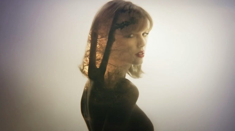
However, I watched the music video, and it definitely fell short of my expectations, especially after the video for "Blank Space" which is beautiful and pure genius. The scenes are all choppy and go back-and-forth in no purposeful manner; it's hard to follow. And while I can see the parallel with nature never going out of style (i.e. lightening has always happened), the forest/beach clips seem out-of-place. Also, I was really confused by the mish-mash of images of her face on his face/curtains/shards of glass/etc. and vice versa. I'm not sure what that has to do with never going out of style. That part just seemed artsy for art's sake; I guess that's okay because both music and video ARE art, but with a layperson audience, being literal doesn't have to be a bad thing (see below).
Here is what I would have liked to see: If something never goes out of style, that means it's timeless, right? So this song is about a timeless romance. So why not show a couple (i.e. Swift and some hottie) that gets together and then breaks up every couple of decades? You could have the 1920's Gatsby era, the 1950's Grease time, the 1960's flower-power/hippie phase, the 1980's (which needs no description), and then modern times? And the running themes throughout would be the words in the song: the red lipstick, the white T-shirt, etc. (which the current video does but not in the way I'm imagining).
 |
| Screen shot. |
I get that it's hard to top the video for "Blank Space." But I think they could've tried a little harder. But Swift looks to die for (as usual) in this new video, so at least there's that. #GirlCrush
 |
| Screen shot |
No comments:
Post a Comment